


Viz Media is starting the new year with a brand new website! And that is sadly where my enthusiasm ends.
I’d stated a short while back that I’d be continuing with my publisher website reviews, a longer than intended hiatus previously taken after several companies requested I wait. Viz Media’s website, or their old one at least, was my newest completed review, a rather frustrating irony in that so soon after I finished did this new site go up. But I digress, this is about the new site and naturally after finishing a review of their old site, and thoroughly going through my likes and dislikes of it to myself, I had presumptuously high hopes that I may see some of my complaints already addressed in this version when I saw it was live.
Alas… Viz Media, what were you thinking?
The change is definitely a big one, the white backgrounds and multi-column layout have been replaced with a more sparsely laid out grid and fancier Javascript based navigation and design. While the old site didn’t immediately scream ‘book publisher’, this new site makes it even less clear what they do and what kind of company they are. It looks like the beginnings of a store more than a publisher’s website with information of series difficult to find – or more accurately to say, completely non-existent.
The worst part, worth noting right off the bat, is that the majority of links clicked on lead to a maintenance page:
Page Under Maintenance
This page is currently undergoing maintenance. Please check back soon!
While one could argue invalidity in reviewing a website clearly labeled as undergoing maintenance, I’d refute that there’s no reason a site as unrefined and clearly unready to go was put live in the first place. Viz Media has put this out there as something they see fit for visitors and thusly as their chosen representation. Areas of the website that aren’t working include all informational pages on the series, Privacy Policy, Terms of Use, Contact, Jobs, Press Releases, FAQ… in fact, the only pages that are working seems to be the main page and the indexs of Manga, Anime and certain imprints.
All previous links to Viz Media’s website now lead to broken pages with no redirectors put in place. Search engines have become almost entirely obsolete in finding the website or information specific to anything they offer and it’s unfortunately guaranteed to cause a plummet in their page rankings making it even harder to find their site once (we assume) it does finally does get off the ground.
Graphically the pages are fairly openly laid out, mostly light on text with a scattering of gridded images. The black backgrounds make for a richer looking appearance than before but the exact same layout on every page is stagnant. Regrettably their use of large graphics, which animatedly shift between different pieces of artwork, is a distracting eyesore, engulfing the entirety of the screen but offering little substance. All links on the artwork leading to what we assume is information pertaining to them is either not yet functional or broken. The majority of the pages themselves also aren’t probably sized to different screen sizes and cause cut-offs on the right side with scrolling to dead space. The bottom of the site also has blank white space for an inch or so which looks more like a mistake in coding than an intended design element.
When you load it up, the main page of the website looks like this (with different images rotating in):

It promotes one series at a time with a single graphic, definitely a domineering feature when you load the page so it’s effective at marketing a single volume or DVD at any rate. Any further information on the site however, such as recent release information, requires users to scroll down to find it. There’s also nowhere on page that introduces Viz Media as what they are or what they provide – no ‘About’ Viz Media with the exception of short introductory paragraphs on the Anime and Manga specific pages.
Navigation on the top of the site has been reduced to three specific headers – Store, Products and Company. Though tidy it also imbues the notion this site has very little to offer. Hovering the mouse over each one yields a drop-down menu with more options including links to different site imprint pages. The coding is a little choppy on this and flickering happens easily when trying to use them (plus they crashed the page out twice when trying to use them via Safari on my iPhone).
Upon using the navigation links to go to a specific imprint page, you’re greeted with a two-option page banner – the first a graphic heavy promotion of key titles under Features (which again sport no working links) – and the second is the option to click Series Listing which prompts an inline frame that has a list of all the series published under that name. Currently none of the titles on the list are linked to anything and provide no information past the title.
 At the bottom of every page there is a New Releases and a Coming Soon section which have click-through lists of just what the sub-sections would indicate. Information provided is thumbnails, title, volume number, release date, imprint, age rating and a Buy Now button leading to Viz Media’s own store – all of which are great to have. It’s too bad though that this information is pushed down at the bottom of each page, and with no links leading to be in-depth information such as a synopsis or prior volume information, there’s a serious hampering of their effectiveness. Navigation of it also isn’t entirely clear, requiring button clicking at the bottom to move from Next or Previous which then utilizes an animated scroll screen to view more titles.
The top of the site has a large easy to find search feature and the results of which are the most promising of this new design. Typing in ‘Bleach’, as an example, returns a long page of thumbnails for all existing volumes of the manga, DVDs from the anime and the art books. It loads fast and is very thorough and tidy. Unfortunately the links either lead to the Viz Store or to another Page Not Found site.
Past missing the information itself, the site also lacks any reference to their submission policies and no more blog on the front page, adding to the Under Maintenance contact page to make this is a completely cut-off site communicatively with consumers. Thankfully all of Viz Media’s previous imprint specific websites such as ShojoBeat.com and ShonenSunday.com remain intact and provide the information their hub website now lacks.
All formalities aside, this is a rather big stinker of a website. The navigation is poor, the graphics and needless animations distracting (and really hurt my eyes I must admit) and the lack of information is mind-boggling. What’s worse though is why Viz Media would put such an unfinished website up in the first place – was the idea of starting the New Year with a new website more important than ensuring the quality of the site itself? This website may be framework for something better, but as it is it has no place live to their customers, providing little more than dead ends, broken links and a veritable style over substance approach to marketing.
My diagnosis – bad site. My recommendation (and hope) is that Viz Media puts the old site back up and offers this new one as a beta for preview purposes only in the meantime. They should get user feedback on the new look and keep adding new content and working out the bugs until it’s fully ready for the public.
Don’t get me wrong, this can be a good site but right now it definitely isn’t.
 Follow


[…] This post was mentioned on Twitter by Lissa. Lissa said: New Blog Post – Viz Launches New Website http://www.kuri-ousity.com/2011/01/viz-media-launches-new-website-and-leaves-much-to-be-desired/ […]
I'm so glad to see such a thorough criticism of this new website; I was flabbergasted that they could go live with something so unfinished.
This website gave me flashbacks to Del Rey's Suvudu website — flashy but completely useless. That's not entirely fair since this site atleast has links to pages that should be useful in the future, but the fact that none of them work is completely inexcusable. A company the size of Viz should not have a website which (for 3 days and probably more) is unusable. I wasn't a huge fan of their old website's aesthetics or navigation but atleast I could get the information I needed! They need to fix this new website soon or put back the old one until they do (I really like your idea of this new one becoming a beta).
Suvudu is definitely up there for nonsensical publisher websites. At the same time I think their switch over to that new style was another sign of them shutting down the majority of their manga line and handing the licenses over to Kodansha.
I'm still trying to wrap my brain around why Viz Media made the decision to put this half-site live. Part of me thinks it was an accident and their web person was unreachable over the holiday season to fix it (I hope that's the case anyway!).
[…] Lissa (Kuriousity) Pattillo has some thoughts on Viz’s terrible new web site. Filed Under: DMP, Linkblogging, NEWS, Oni, Polls, Previews, […]
Well at least they are trying to come up with something new,
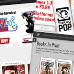
compared to Tokyopop(mass confusion)or Netcomics (no updates at all).
I've no complaints to something new but something new seems pretty pointless if it just makes things worse. I like seeing Viz Media working on their web site but putting up something in this state, which will only frustrate visitors, doesn't seem like the kind of new direction anyone should be going. Hopefully we'll see something more stable soon.
[…] it this morning, virtually all the page links were broken. Lissa Pattillo noticed this too, and she critiques the design and workability of the new site at […]
The new site is awful! On the old one, you could at least see information for all their series (new and old). For the upcoming releases section to not even be subdivided by month is just plain bad. What a mess.
I agree that VIZ launched the new site prematurely, but I had a very different reaction to the new site: I like it.
I think the new site design is an improvement over the old one, especially when it comes to locating stuff on the site. As someone who regularly covers the VIZ Kids imprint, for example, it's nice to be able to find those titles in just one click instead of two or three. If VIZ can replace the old series information pages with new ones, I think it will be fine.
As for communicating what VIZ is all about, I think the new site does that more effectively than the old one. It puts the emphasis squarely on characters and stories, which is why most of us read manga and watch anime in the first place.
I think the new site has definite potential – the bright colours on black are immediately striking and certain areas are nicely laid out. It's hard to see the charms though when any actual use of the site is currently minimal at best and there's a number of structural issues with the code and layout that can reck havoc for their visitors. It'll all hopefully look a lot nicer when there's actually more to do than just look at a few broken pages.
And I like your point about putting emphasis on the characters and stories, it is a nice addition and really shows off what makes Viz Media popular. At the same time I still think it the way they have it set-up is overshadowed the practical use of a website but I've got my fingers crossed for a happy medium!
I got quite a shock today when I was greeted with this new design on Viz's website. The shock didn't come up so much from the new layout, but rather like you mentioned, the complete mess and lack of information.
I still wonder what changes they'll do to the manga information pages. Hopefully it won't be a step back, as I really enjoyed the last format.
Either way, lack of information aside, I still do have a minor complaint. The problem about the pages being too tall. I hate to have such a big advertising space at the top, forcing us to scroll down unecessarily to access the more important information.
I agree completely about the pages being too tall. I made note in my criticism about this because it really hides the parts of the site that are most valuable, and for this new launch one of the few really positive attributes (being the Release Schedule). I don't mind the graphics but I think it'd help a lot to have them considerably smaller.
And they've finally fixed and updated the rest of the site. Surprisingly, there is no big modification to the manga info pages. Actually, it seems to be pretty much the same. Just arranjed slightly different. Which is cool.
Also, the adverts are clickable and take you to the respective series info, which is nice.
There's something about the manga info pages that bugs me though. Again, it's too tall, but here is due to the large empty space in the top where the title is. Might not be a problem for people with desktop computers, but for people with 16" laptop screens with 800px height, it forces you to scroll down once, which is a bother.
Anyways, guess I should stop writing, I got carried away. :p
Thanks for the update on their site! It's good to see them putting up that new info.
And I can see what you mean about the gap problem for small screens on the info pages. My desktop is a pretty large resolution-size but the layout's a bit broken in that it forces scrolling into blank space on the right side. It'll be easier for them to smooth out those visual hitches for different computer users now that they have content to work around though, I assume.
One thing I noticed that I really like is the URLs for the main page of manga titles, such as vizmedia.com/death-note. It makes finding series' information easier if you can't find it through the site itself for any reason.
To the individual who wrote the rebuttal to my post re: Viz Media's website, thanks for taking the time to comment! I apologize that your post was mistakingly deleted after being deemed spam by WordPress along with a couple others early this morning and completely welcome a re-comment if you're able. I had read your comment and will try to respond to all points I can recall.
In response, I still hold to my thoughts that Viz Media launched their site prematurely. I say this as a consumer and frequent visitor to their website. The fact that they were able to upload a bulk of their content a week later only further proves they could've waited a short period and launched their new site complete with content.
Websites 'are' updated as they grow and evolve, designers are constantly making little tweaks and changes. I still don't believe that changes the fact they should have the bulk of the content completed for the initial launch when you're dealing with a site that already had all the previous info in the first place, plus has so many consumers reliant on it. Doing what they did painted a bad picture for the company, like it or not, and I'm by no means the only one who pointed it out.
Searching for any of their manga titles that didn't already possess an outside website of their own lead to broken links in multiple search engines (I searched many different titles to confirm this fact for my post as I often went to Viz's site through search engines) and a number of web-conscious bloggers/site hosts had to go through their own websites removing links to Viz Media's site due to the no-longer existent pages. I think that's an issue. They're new URL set-up is nice however and should work well once it gets indexed.
Was my response biased by the lack of content? Yes, definitely. But that it crashed Safari and still has issues with dead space, scrolling and flashy graphics that push all the relevant content down remains an issue that I would've had it even had it launched with full content intact. Would I have spent an entire blog post on it? Likely not, but those are floodgates for you.
As I finished my post with, I still believe this could be a good site. There's a lot of great elements to it and visual elements that work well. Katherine also pointed out an earlier comment the value the character-driven artwork has and I completely agree with her, even if I think the images themselves are too big. The images themselves though, very nice.
Viz Media's still has work to do but it's good to see it happening. I'm not sure why they chose to go this route and certainly never claimed to. Do they have a new graphic designer? Was there a problem with the old site that required it quickly removed? Was it a New Year's plan that fell short of completion? Was there simply a mistake? Who knows! What matters now is they're fixing the problem, and that works for me.
And I have my reasons for no H1 tag :) But I hope you had fun spelunking my code for a reason to make a personal poke – it's not a true rebuttal without one on the internet ^^
[…] yours was one of them (including someone who wrote a detailed and honest rebuttal to my post about Viz Media’s website, and a comment on my Ouran Host Club review), I apologize profusely and welcome a […]
[…] – last did a large revamp of their website in January 2011, where I gave it a thorough and not especially glowing review. This time around the company has really gone for the simplistic route and I think it serves their […]